Posted on Friday, April 15, 2022 · Leave a Comment
OMFGCO was not the only key player in Hue+Cry’s visual refresh. The logo by OMFGCO, wordmark, and type design language was just the beginning. Hue+Cry then had to roll it out to dozens of applications before it was go-time.
As part of the rebrand, the studio collaborated with Portland design & branding shop OMFGCO. “Obviously, we design at Hue+Cry –– but if we were left alone to do our own rebrand, we’d still be working on it!” quips Darnall. “Their perspective proved to be invaluable for the design process of our rebrand project. They’re fantastic at what they do, produce extremely polished work, and are similar in size to our company. We really appreciated the similar levity in their work that we value in ours, which was an important quality for our partner to have.”
From the release:
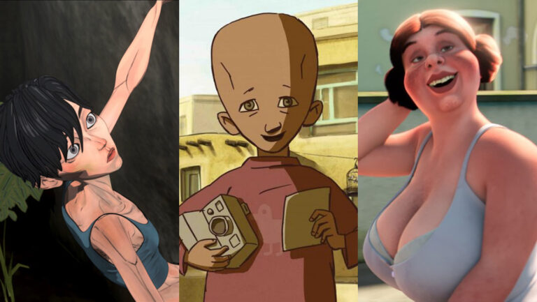
Since it was founded in 2013, Hue+Cry has grown to work with notable clients and projects across numerous industry verticals for leading agencies, brands, and companies on all of their design and animation strategies, creative, and production needs. Displaying creativity and inviting curiosity, the company’s new website features recent work from clients like One Medical, Neutrogena, Zillow, and more. It also contains a full case study on the Hue+Cry rebrand. Coming soon, the studio will be revealing new work for Blink Fitness and Pirate’s Booty.
The rebrand all started with Hue+Cry looking critically at their website. “We are very proud of the work we make, but we didn’t think our website flattered our work,” acknowledges Darnall. “The bold, bright colors and wall-to-wall imagery of the old website design overwhelmed the art.”
For Hue+Cry’s rebrand, this meant more negative space. The new identity’s aesthetic called for more black, more white, and less hot pink and magenta to allow its projects to breathe. “After discovering this, it became clear we had to think bigger about the brand as a whole,” says Darnall.
“To put it simply, we wanted the brand to get out of the way and let the work speak for itself, and to do that we had to simplify,” admits Darnall.
”Minimal, bold, and appealing, it represents both the characters of our studio and the ones that we make,” explains Managing Partner Magnus Hierta on the studio’s updated monogram. “The measure for a good mark often is in asking if it is memorable and will it stand the test of time. We think we have that, but most importantly, we have something we are excited to use and work with every day.”
Working primarily in black and white and utilizing classic typography like GT America and Inter, the rebrand unveils itself with a minimalist look allowing Hue+Cry’s energy, boldness, and enthusiasm to subtly yet confidently shine. Its simple design keeps its recognizable and distinctive name as the hero.
Hue+Cry’s rebrand reflects the studio’s growth and evolution. It also demonstrates the changing business dynamics of an increasingly in-demand, diverse marketplace in the animation, design, and arts industry. “Artists and their creative endeavors are always evolving, growing, and changing and a studio is no different,” shares Darnall on the reason behind the rebrand. “Hue+Cry has evolved over the years, and the brand has evolved with it, too -– in some ways that we wanted to correct. After stepping back and reflecting on how we present ourselves, we decided it was time for some spring cleaning…which quickly evolved into a major renovation.”
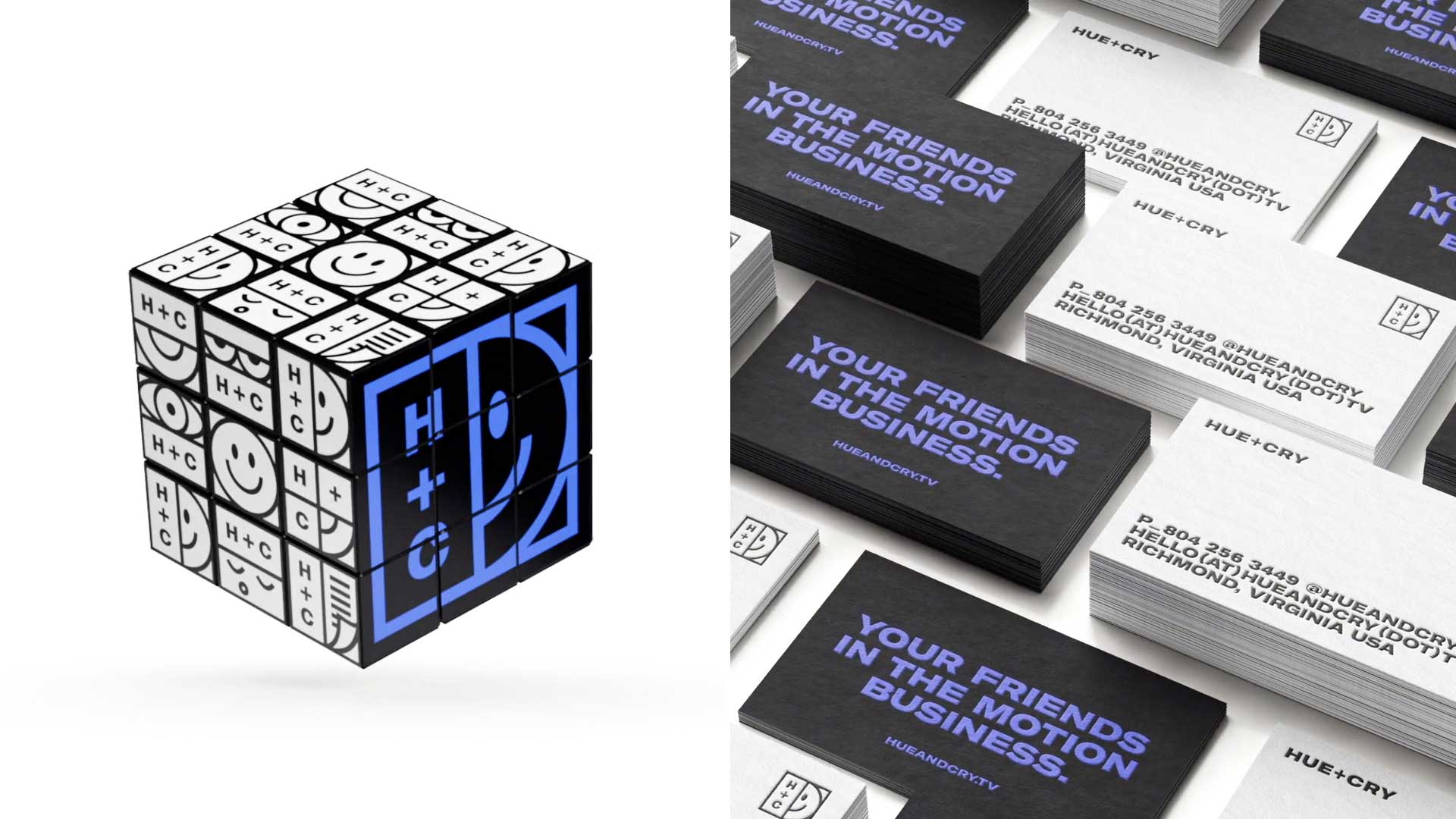
“Implementing a new brand language is a beast,” adds Executive Producer Scott Friske. “Everything from new websites and new swag like hats, shirts, totes, and stickers, to redesigning and updating documents, email signatures, and slates is a major part and challenge of the process.” Hue+Cry also created a plethora of custom art and animations to support the launch.
Enthusiastic to introduce a brand new look, the company has overhauled its identity and rebranded, moving away from its original logo and bright colored palette and opting for a fresh new, sprightly aesthetic spearheaded by the studio’s Creative Director Matt Darnall.
“I think that’s why this rebrand is so special and personal to us – it was a real team effort to put it all together,” expresses Darnall. Every person at Hue+Cry was integral to the rebrand that happened over the course of a very busy but enjoyable nine months. “Lauren + David + Trish + Travis + Cloie + Luis + Meagan + Jeff + Scott + Magnus, and everyone else that put a little piece of themselves into this: Thank you – it’s ours!” appreciatively exclaims Darnall.
To go with the hero mark, Hue+Cry has a library of alternate logo marks that express its capabilities, interests, and ability to adapt all while remaining on-brand. The modular nature of the alternate icons bring a lot of animation and design possibilities to explore. “It allows the brand to grow as we grow –– which I think is a strength of the new brand,” states Darnall.
From a visual standpoint, Hue+Cry has refined itself down to the fundamentals. The company’s previous brightly-hued fuchsia and navy color scheme, speech bubble logo, and ampersand wordmark have been refreshed with a new primary logo that is split between H+C, the studio monogram, and half of a smiling face.
Taking stock of its challenges, Hue+Cry also had some secondary illustrations on the site that were part of the past brand that pigeonholed them into specific executions like flat 2D work. While the studio prides itself in 2D vector-based work, they also love painterly illustration, sophisticated graphic design, cel animation, and 3D executions that are both shiny and not shiny along with everything else in between.

