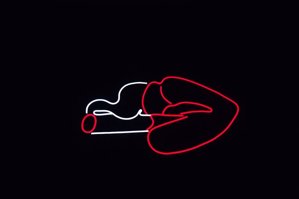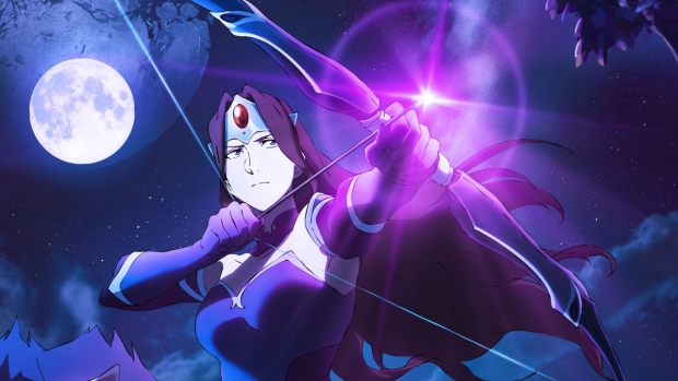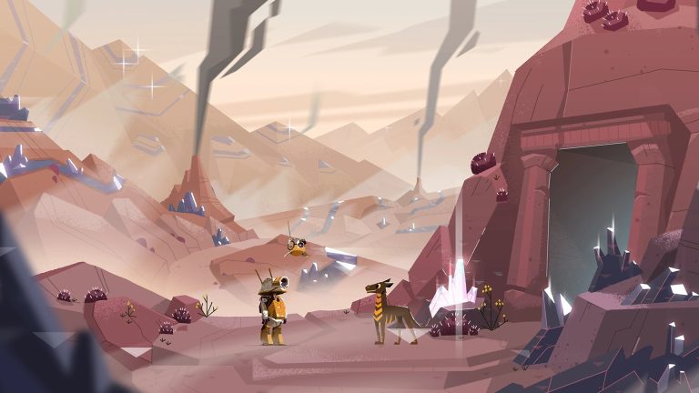
MTV’s new three-color logo evokes the brand’s classic logo, fondly remembered for its colorful, expressive, and confidently flexible applications. “We created a system based on the famous shape of the M taking on different personalities, forming and reforming, and decking itself out with patterns. The brand can dress up or down, with the flexibility to be as loud as it needs to be,” explains our ECD Anna Minkkinen.
Client: MTV
Posted on Saturday, November 13, 2021 · Leave a Comment
Agency: Loyalkaspar
There are only a handful of brand elements that can remain cohesive across platforms—you don’t want your logo on everything. “MTV’s typeface is called Gravity because it is a force that, like gravity, helps hold together the world of the brand across platforms. A typeface creates a consistent through-line for the brand that can be present in ways that don’t feel oppressive or promotional,” describes our ECD Anna Minkkinen.
From the release:
We designed a motion language and library of custom patterns for MTV inspired by the brand’s iconic logo shape and graphic heritage. “Every design system needs consistency with specific elements, the things people absorb subconsciously. The tighter a brand is with those elements, the more expressive it can be everywhere else, and that freedom will allow MTV to naturally evolve as culture changes,” our CD Chris Harmon explains.

