Pantoja dismisses the misconception that adding more frames always results in smoother animation and higher production value. He argues that while yes, things will move more smoothly – if spaced properly – it’s possible to go too far and make something that feels “too floaty because things are constantly moving and gliding into certain poses.” Sometimes, scenes with limited frames but which are composed of good, well spaced drawings can be more powerful, he contends, even advocating holding onto certain frames for longer to increase their impact.
Rotoscoping vs Heavy Reference
Solid drawing, or the draftsmanship principle as Pantoja puts it, includes the technical and structural side of drawing as well as the construction side: straights versus curves, asymmetry, and line weight. He argues that all these concepts fall under solid drawing, and not appeal. He also expresses his distaste for the word “appeal,” as it comes with inherent bias. For many, appeal refers to something that is visually pleasing and that shouldn’t be the case when discussing appeal in animation. Appeal is the charisma of the drawing, the personality in the art. This means that something which is drawn ugly, uncanny, or uncomfortable which was meant to be that way is appealing, even if it’s not cute.
Appeal vs Solid Drawing
This common mix-up first came to Pantoja’s attention when he made a video about studying and copying frames from live-action footage. “People came to the conclusion that I was rotoscoping,” he recalls. That wasn’t the case however, as Pantoja was drawing his frames from scratch using the original footage as a reference, rather than drawing over the existing live-action footage or tracing. He argues that it’s unfair to animators to assume that animation which moves in a hyper-realistic way must be rotoscoped.
More Inbetweens = Smoother Animation
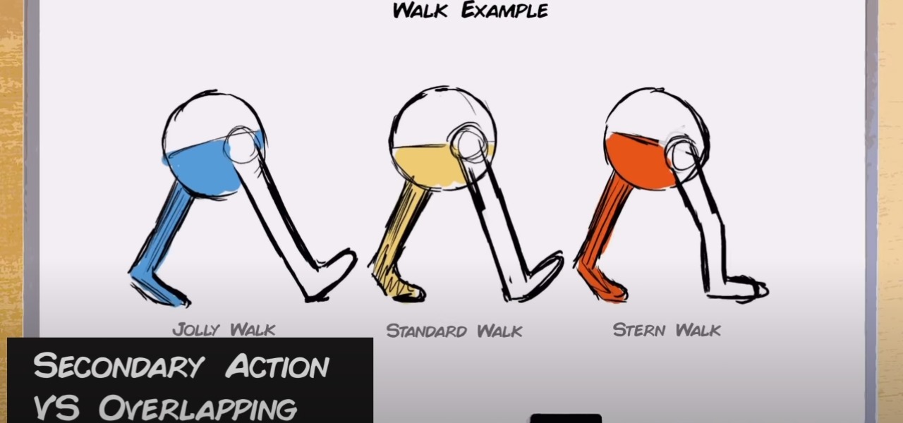
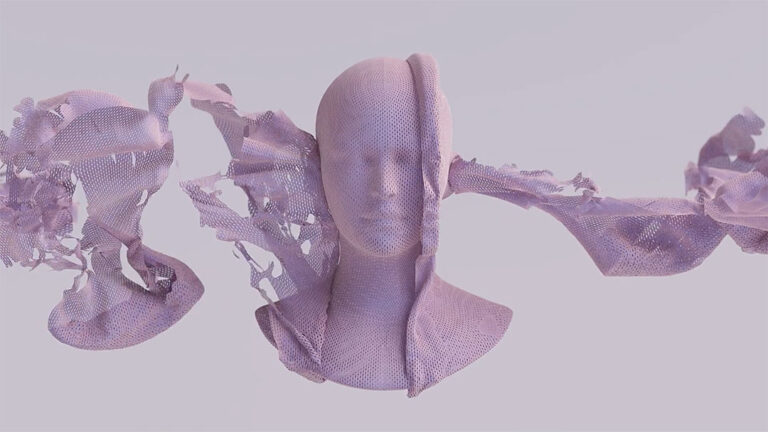
Pantoja’s frustration hits its peak when discussing secondary action vs overlapping, which he sees as the most regular mix-up that even professional animators make with regularity. Overlapping is the follow through of things like hair, cloth, and body parts where one part of an object begins to move or fall while the rest continues in later frames. So, what is secondary action? Pantoja’s simple explanation is that: “It’s a layered attitude on top of the primary action.” In his example, he uses a pair of walking legs to show how small details and nuances can be used to indicate how the character is feeling, from jolly, to normal, to stern. It’s the pep in a character’s step.
Timing vs Spacing
In the 12-minute video, Pantoja, who is also an experienced industry professional, outlines six mistakes or misconceptions common among animators, amateur and professional alike. He also gives concrete examples and offers explanations or solutions to avoid future confusion.
Secondary Action vs Overlap/Follow Through
Long-time Cartoon Brew favorite YouTube Toniko Pantoja put out a new video this week, pleading with animators to stop getting a few basic things mixed up when discussing animation.

Squash & Stretch vs Weight
Adding more squash is not necessarily the right way to add weight to an object, Pantoja argues. Other effective means to demonstrate weight include adjusting timing, overlapping action, spacing, slow ins and outs, and overall drawing. He also argues against critics of squash and stretch who complain that it’s too cartoony or distracting, explaining that even in hyper-realistic animation squash and stretch can be used to add weight in a more subtle way.


