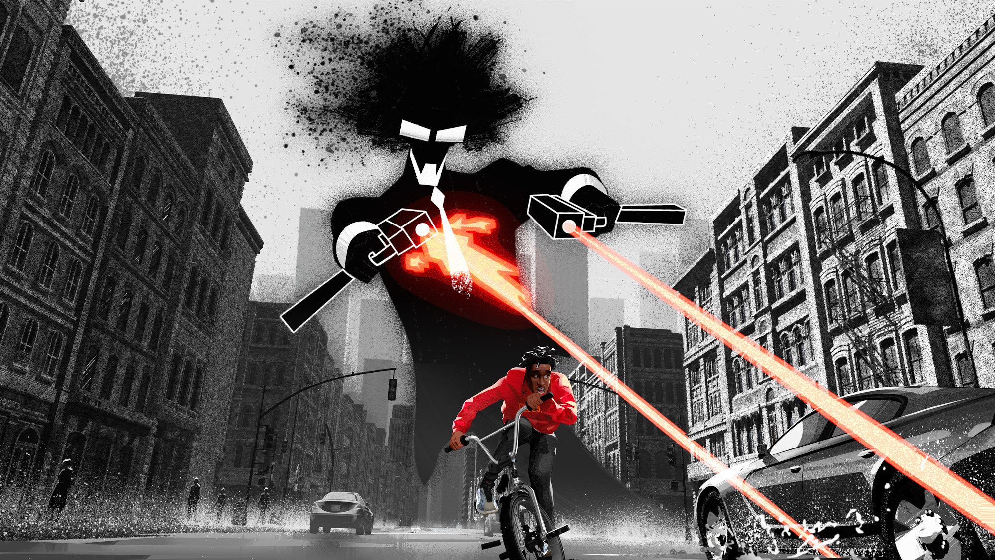
Donato: One difficult part was that Jabari, the main character, rides his BMX everywhere. So he cuts through several boroughs in a single sequence, and it was incredibly important that we maintained a continuity of New York. What we did was set up geographical markers and say, “I want to see the Chrysler Building in this shot,” or “The Empire State Building should be in the background here.” To do that, we downloaded a 3d map of Manhattan and rebuilt it in our pipeline, which was obviously more stylized, more disproportionate. I spent so much time on Google Maps imagining I was riding a bike through those neighborhoods.
Sharma: Like Archie said, we had a really great PDF of artwork to work from, but those were all static images. The big question was, “How are we going to translate that style into motion? We had to come up with what they would look like when they were talking. So we used a few live-action movies to try and capture performances like our characters needed to deliver and used them to make it feel real in a way that was needed to tell our story. That being said, we did have a few animated films we used as visual references which we thought accomplished those goals. We watched I Lost My Body and were really inspired by the way that film felt so authentic.
DNEG in London handled animation, tasked with adapting a detailed portfolio of concept art into a 3d-animated production that looks 2d animated, has a painterly aesthetic, is subtle but still relatable, and unspools in a New York that is both stylized but also largely spatially accurate. Easy right?
So Archie you’re from L.A. and Kapil you’re in London. What did you do to create your version of New York and how did you keep it so authentic?
Did that create difficulties with how much the story moves around the city?
And how did that manifest itself technically?
Netflix’s ambitious new special Entergalactic touches down on the streamer today. Unlike anything the platform has done in the animation space in the past, the 94-minute musical love story is the brainchild of rapper Scott “Kid Cudi” Mescudi and Black-ish creator Kenya Barris.
Donato: This was a Kid Cudi project, right? And New York is such an incredibly important city to him. I was lucky enough to live in New York for a few years in the early 1990s, so I was familiar with the city. But when we were making this film, the story had a map that you could literally stretch strings across and connect the locations we used. Probably 95% of the locations in the film are accurate to their real-life physical location. Obviously everything is pushed stylistically, but when the characters are in Chinatown you know they’re in Chinatown.
Cartoon Brew: When and how did you two first get involved with this project?
Sharma: We put in a lot of time researching how to execute the facial animations technically without losing the painterly look when the parts of the face would move. We did lots of testing with the wireframes, and how parts of the face would move together. And we played with lighting a lot too. I never used to think so much about lighting as much as I had to on this film. One thing we were always sure of is that we didn’t want to use mocap or rotoscoping. We didn’t want to just have a real-life performance, but to capture a real-life performance in the animation we were doing. On the other hand, we didn’t want to be too detailed with every frame either. There are movies where every frame is touched up or changed. In our film there are times we spend eight frames on the same image to try and really capture a moment. During dailies we would look at final images and ask how we wanted the audience to feel, if we needed any movement to achieve that feeling, or would more movement be distracting? Sometimes less is more. I think our animators really had a blast creating these performances.
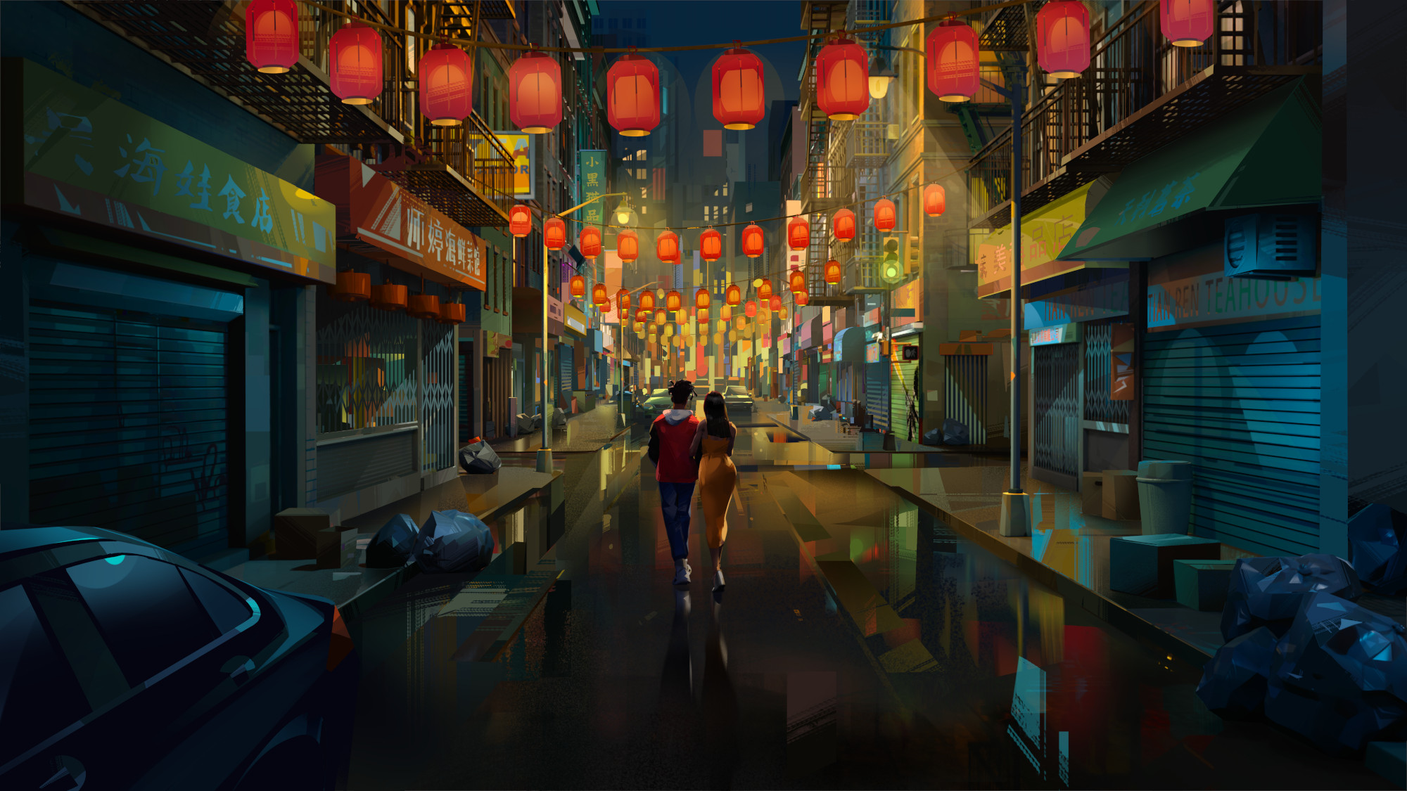
Donato: I think what convinced them that we were the right choice was a couple early tests we did for them. One big thing was that they wanted a 3d movie that looked like a stunning 2d movie. They wanted it to always feel like you were stepping into a painting. That was the director’s dream. Once we got the job, the first few months were weird because we had to forget 30 years’ worth of experience in 3d animation and start over, you know?
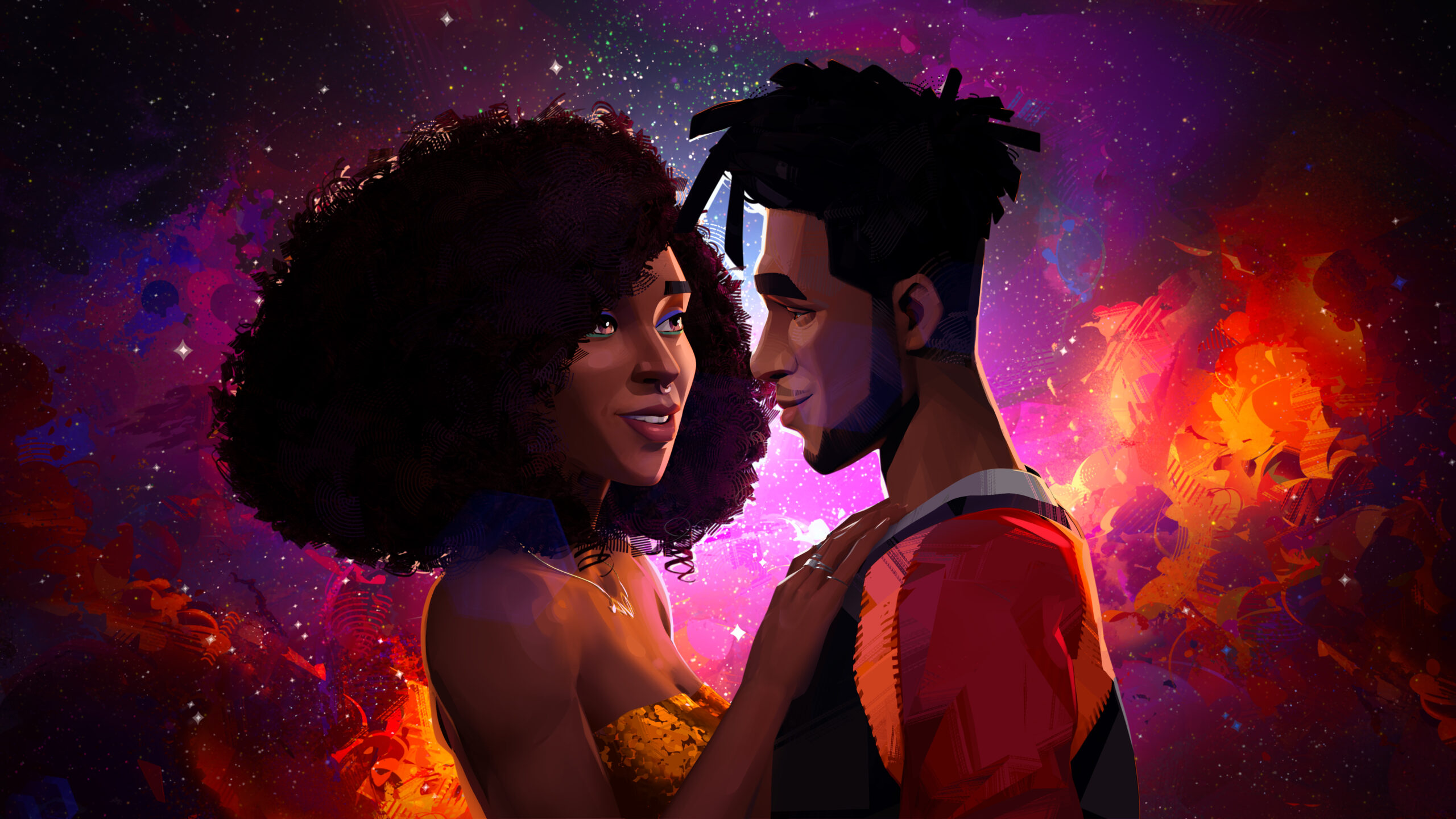
Directed by Fletcher Moules, the special tells the story of 20-something Jabari, a street artist-turned-comic book creator who moves into a posh new flat in Manhattan after scoring a new job. As he’s settling in, Jabari becomes aware of his neighbor Meadow when a party at her place goes long into the night, disturbing his sleep. The late-night meetup, with him in his pajamas and slippers and her looking like she just stepped out from the pages of a magazine, sparks the first embers of a new romance.
You mentioned live-action influences. Any in particular you can name?
About the characters, how did you handle their design?
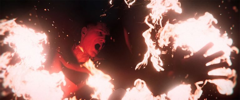
Archie Donato: We got involved literally as soon as they were ready to start making the movie. I got a call from David Prescott saying, “I have something that has your name written all over it.” But the job was in London, and I wasn’t sure about Covid and relocating. But they had already done a significant amount of development on the artistic side, and they showed us this incredible PDF of what they had been working on and I said, “When’s the next flight to London?” I know I’m speaking for both of us when I say this, this was something we’d been waiting our whole careers to work on. We come from traditional cg animation and vfx, but always the very standard Dreamworks/Pixar style animation. So to get involved in adult animation like this was a huge thing.
Donato: They knew exactly what they wanted and trusted us to figure out how to do it in 3d. The idea was not necessarily to make an animated film, but to forget the medium and focus on how to tell a great love story. So we had to forget our animation backgrounds and work on something more realistic and engrossing for adults.
And how did the DNEG-Netflix partnership work out practically?
Donato: When we got this project, we were told it was a sort of modern version of When Harry Met Sally with two Black kids in their 20s who fall in love, and the awkwardness of that new love when you don’t really know each other yet. I think Kapil’s team did such a wonderful job of capturing that because it’s super difficult to create awkwardness in facial expressions subtly. So we watched a lot of specific scenes in When Harry Met Sally for inspiration, especially scenes of the two of them just talking nonstop, walking through the streets for blocks and blocks talking to each other the whole time.


